Data Capture 2.0
Design Case Study
Users
Cigna Offshore Claims Processors
Platforms
Desktop
Year
2020
Client
Cigna Operations Team

Project Overview
As part of a global initiative to improve affordability and reduce manual overhead in claims processing, I led the redesign of Cigna’s claims ingestion interface. The goal was to create a faster, smarter experience for offshore claims processors by shifting from manual data entry to a semi-automated, validation-based system that reduces errors, improves speed, and lays a scalable foundation for international operations.

The Problem
Cigna’s existing claims ingestion process relied on a manual, error-prone workflow. Claims processors had to transfer data from scanned PDFs into a Microsoft Access form, referencing external Excel sheets for currency formats and escalating errors over email. This slow, fragmented workflow delayed claim progression, limited scalability, and introduced high operational costs.
As the UI Designer
Conducted user interviews with offshore teams in India to identify workflow pain points
Designed a side-by-side form interface with auto-populated fields and an integrated PDF viewer
Collaborated closely with engineering and product teams to accommodate Salesforce Velocity constraints
Delivered wireframes, a UI style guide, and documentation in Figma and Zeplin
Participated in weekly Q&A sessions during development to support implementation and UI refinement
Solutions & Outcomes
Users manually transferred data from PDFs to forms
Key Design Solutions
Challenges
Design Solutions

Outcome
Approved for rollout across multiple international teams
Reduced manual input and error frequency
Enabled scalability for faster claims ingestion across regions
Extended UI/UX involvement by two additional months due to design value and collaboration with engineering
Users relied on Excel for currency formatting
Added contextual info icons beside amount fields with localized currency format guidance.
Confusing button labels (e.g. "Hold" vs "Pending")
No error prevention for outlier values
Replaced with clearer terms: "Escalate", "Close", "By Pass", each with distinct behavior.
Introduced inline validation alerts for extreme or missing values.
Built an auto-populated form; users now validate instead of entering data.
Users needed to leave notes on individual claims
Added a comment field in the fixed header for quick reference and continuity.
Business wanted visibility into productivity metrics
Designed a homepage dashboard with self-serve performance stats (e.g., claim counts, average time).

Homepage Default View

Medical Claims Intake > Form with Error View
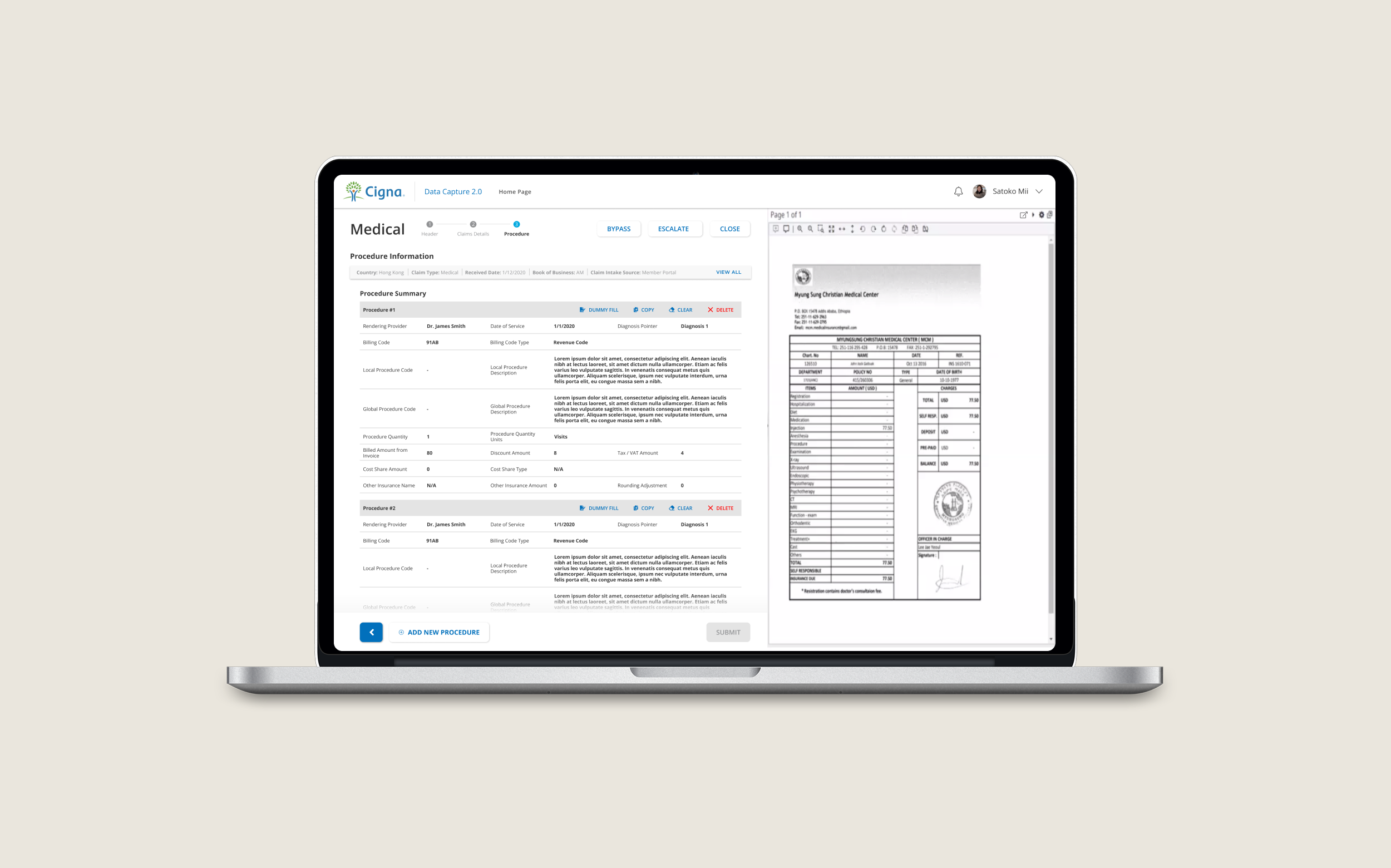
Medical Claims Intake > Procedure Records View

Pharmacy Claims Intake > Form with Currency Guide

Claims Information Available to View at Any Time

Dual Monitor View
Reflection
This project pushed me to navigate legacy workflows, shifting business requirements, and Salesforce design constraints — all while advocating for the user. I learned how to balance dense data interfaces with clarity and accessibility, and how to keep teams aligned during ambiguity. If UI/UX had continued into development, I would have pushed for deeper metrics integration and formal user testing to support long-term improvements.